• About FCP

The Five Cat PENagerie

~ Ink and Fountain Pen Reviews

The Five Cat PENagerie

Category Archives: Ink Comparison

Rohrer & Klingner Verdura – Sponsored By JetPens!

14 Monday Apr 2014

Posted by Five Cat Penagerie in Ink Comparison, Ink Review, Rohrer & Klingner, Uncategorized

≈ 4 Comments

Tags

brause, dip nibs, dip pen, Fine Nib, Flex Nib, Flex Pen, flexible nib, Fountain Pen, Fountain Pen Ink, Fountain Pen Ink Review, Green Ink, Ink, Ink Review, Iroshizuku, J. Herbin, jet pens, jetpens, jetpens.com, noodler's creaper, Noodler's Flex, noodlers ink, r&k, rohrer & klingner, rohrer and klingner, rohrer klingner, Shading, sheen, verdura, waterman, waterman 52, waterman 52½V

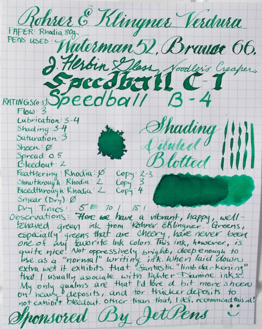
I’m incredibly excited to be debuting my first SPONSORED ink review! The ink for this review was graciously provided by JetPens.com. This particular ink is a very bright, happy light(ish) green with good shading and consistent performance. You can find it for sale on JetPens.com, right here.

Photo Apr 14, 8 57 02 PM

IMG_7528 - Version 2

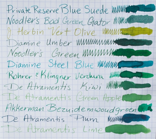
Here are some comparisons with other green inks:

IMG_7530 - Version 2

IMG_7533 - Version 2

And some not so green (disregard the typo about blue ink):

IMG_7535 - Version 2

And on some common papers:

IMG_7542 - Version 2

IMG_7542 - Version 4

IMG_7542 - Version 3

And lastly, the torture tests. Though it fought admirably against acetone and alcohol, it didn’t fair well at all against water and ammonia (and, of course, bleach obliterated it, but that’s hardly uncommon for most inks). The faint writing on the bottom of the page reads “Ten Minute Soak”. Obviously this ink wasn’t meant for Seattle.

IMG_7537 - Version 2

So, if I had to nitpick, what would I change about it?

Well, I’m a big sheen fan, so obviously I’d love it to have more of that, but the fact that it doesn’t isn’t a negative in and of itself. I have found that, with the exception of their iron gall inks, Rohrer & Klingner inks seem to be more prone to feathering than most other “up market” inks, even on Rhodia. Feathering is one thing, but bleedout just annoys the heck out of me (see the “Brause” sample). Again, this seems pretty common with R&K inks.

I like to again thank JetPens for making this review possible! I’ve been a loyal customer of theirs for years, and in fact my very first bottle of fountain ink was purchased from them—J. Herbin Vert Réséda (along with several Brause nibs that thoroughly annoyed me until I figured out how to play them like Charlie Daniels plays his fiddle). I don’t take recommending online shops lightly, and there are few that I will do business with on a regular basis, and JetPens has been one of those, years before I was contacted about a sponsored review. 🙂

The three major iron gall-based inks on the martket…

29 Sunday Dec 2013

Posted by Five Cat Penagerie in Diamine, Ink Comparison, Montblanc, Rohrer & Klingner, Various Pen Stuff, Writing Sample

≈ 1 Comment

Tags

blue black, blue black ink, blue ink, crappy paper, dark blue ink, Diamine, diamine registrars blue black, ferric, ferric ink, gall, gall ink, iron, iron gall, iron gall ink, midnight blue, mont blanc, montblanc, montblanc midnight blue, registrars ink, rohrer & klingner, rohrer and klingner salix, salix

I found this while sorting through some old reviews that needed posting. The Montblanc sample was written with a very wet writing Waterman. though since Montblanc callously murdered the iron gall formulation of Midnight Blue I guess it doesn’t matter all that much. 😦

Iron Gall Comparison

J. Herbin Rouge Hematite: Original vs Current Formula

25 Saturday May 2013

Posted by Five Cat Penagerie in A Random Writing, Ink Comparison, J. Herbin, Various Pen Stuff

≈ 2 Comments

Tags

1670, J. Herbin, Rouge Hematite, sheen

Here’s the pre-shaken amount of sediment in the original version of Rouge Hematite (left) versus the current version (right).

20130525-184933.jpg

They took away some of my sheeny dust!

*hmph*

Red Ripple Waterman Collection

24 Wednesday Apr 2013

Posted by Five Cat Penagerie in A Random Writing, Ink Comparison, Various Pen Stuff, Waterman, Writing Sample

≈ 1 Comment

Tags

bchr, Black Swan, blue ink, Diamine, English Roses, Fine Nib, Flex Nib, Flex Pen, flexible nib, Fountain Pen, Fountain Pen Ink, Fountain Pen Network, fountain pen restoration, hard rubber, hard rubber waterman, Ink, Nib, Nibs, noodlers ink, Pens, red ripple, red ripple waterman, safety fountain pen, Shading, w55, w56, waterman, waterman 12, waterman 12s, waterman 52, waterman 52½V, Waterman 55, Waterman 56, waterman safety

Photo Apr 24, 10 59 28 PM

Okay, to be fair the 52½V on the left, the 55, and the 56 are all what we now call the “woodgrain” pattern, and the 12S is the early mottled pattern.

Photo Apr 24, 11 01 19 PM

Photo Apr 24, 11 23 44 PM

Water Resistance Test

16 Saturday Mar 2013

Posted by Five Cat Penagerie in Diamine, Ink Comparison, Iroshizuku, J. Herbin, Noodler's, Rohrer & Klingner, Sailor, Waterman

≈ Leave a comment

Tags

1670, Antietam, apricot, blue black, blue ink, Blue Nose Bear, China Blue, Diamine, epinard, Fountain Pen, Fountain Pen Ink, Fountain Pen Network, Herbin, ink comparison, ink test, J. Herbin, j. herbin ink, ku-jake, Ku-jaku, mysterious blue, noodler's inks, orange ink, Pasternak, prussian blue, Purple Ink, r&k, red ink, rohrer & klingner, rohrer and klingner, rome is burning, Rouge Hematite, rouge hematite 1670, sailor, sailor ink, salix, sargasso sea, Vert Reseda, water resistance, water resistance test, waterman blue black, waterman ink, waterman mysterious blue, Wild Strawberry

Various Soak Test 1

Teaser for an upcoming water resistance test…

12 Tuesday Feb 2013

Posted by Five Cat Penagerie in Ink Comparison

≈ Leave a comment

Tags

ink soak, ink soak test, ink test, ink water resistance, water resistance test

20130212-131104.jpg

Care to guess some?

Diamine Beau Blue

05 Tuesday Feb 2013

Posted by Five Cat Penagerie in Diamine, Ink Comparison, Ink Review

≈ Leave a comment

Tags

blue ink, China Blue, Diamine, Diamine Sepia, dip pen, Fine Nib, Flex Nib, Flex Pen, flexible nib, Fountain Pen, Fountain Pen Ink, Fountain Pen Ink Review, Fountain Pen Network, Ink, Ink Review, J. Herbin, Nib, Nibs, Rouge Hematite, Sepia, Shading

Here’s my review of Diamine Beau Blue, an ink which I’d not given a fair chance and had already made up my mind to hate. But fortunately those feelings changed when I saw that icy blue goodness being laid down on Rhodia. And also, as you might notice, I’ve made up a completely superfluous term to go along with my reviews to describe a VERY desirable (for me) trait of inks that I call…

Grotto…

Diamine Beau Blue (Medium)

And onto the new term: Grotto.

I first noticed this trait in Herbin inks. In fact, if you look at some of my previous reviews I make several references to the “‘Herbin’ look”. It’s the beautiful darker-on-the-edges look that many J. Herbin inks can achieve when they dry on quality paper, and is especially prominent in nibs that are wet, bold, or flexy. I’d never had a name for it, but when reviewing this ink I found this particular quality so striking that I felt I had to name it.

To me it is a very “wet” look, like coffee that’s dried on non-absorbent paper. But I couldn’t call it “wetness” because people would think it just never dries (and what I call a “wet” look may very well trigger something completely different when someone else see’s it). So I ran with the word “wet” without actually using it, and after some thinking I decided I shall call this ink characteristic—at least within the context of future reviews—”grotto”. Grottos are mysterious, often beautiful places that might be harboring secrets. Their walls are often wet, and the water that might come from a natural spring and form a pool in them is clear and cool, straight from nature.

So now that I’ve gotten all the poetic junk out of the way, that’s “grotto”. This ink has great grotto. Not that I expect anyone else to pick up the word (though I’ll be perfectly happy if they do); it’s just a word to describe something I’ve been trying to describe for a long time.

And here are some other inks that have great grotto.

DiamineBeauBlueGrotto

Private Reserve Tanzanite

01 Tuesday Jan 2013

Posted by Five Cat Penagerie in Ink Comparison, Ink Review, Private Reserve

≈ 1 Comment

Tags

Fine Nib, Flex Nib, Flex Pen, flexible nib, Fountain Pen, Fountain Pen Ink, Fountain Pen Ink Review, Fountain Pen Network, Ink, Ink Review, Kung Te-Cheng, NAV, Nib, Nibs, Noodler's, Noodler's Flex, noodler's flex pen, noodlers ink, North African Violet, Pasternak, Pens, private reserve, private reserve ink, Purple Ink, Purple Martin, Shading, waterman, waterman 52, waterman 52½V

Here’s a vibrant purple ink from Private Reserve. It’s a very “loud” color, but didn’t particularly strike me as special, though I know it has a pretty strong following.

Private Reserve Tanzanite (Medium)

A Water-Soak Comparison Of Some Various Noodler’s Blues

30 Sunday Dec 2012

Posted by Five Cat Penagerie in A Random Writing, Ink Comparison, Ink Review, Various Pen Stuff, Writing Sample

≈ 1 Comment

Tags

54th massachusetts, bad blue heron, baystate, Baystate Blue, blue, blue black ink, blue ink, blue ink comparison, blue ink test, blue/black ink, bsb, Flex Nib, Flex Pen, flexible nib, Fountain Pen, Fountain Pen Ink, Fountain Pen Network, Ink, Ink Review, legal lapis, liberty's elysium, midnight blue, midway blue, navajo turquoise, navy, navy blue, navy ink, Nib, Nibs, Noodler's, noodler's 54th massachusetts, noodler's bad blue heron, noodler's baystate blue, noodler's blue, noodler's blue black, noodler's bsb, Noodler's Flex, noodler's flex pen, noodler's fpn, noodler's fpn ink, noodler's legal lapis, noodler's liberty's elysium, noodler's massachusetts, noodler's midnight blue, noodler's midway blue, noodler's navajo turquoise, noodler's navy, noodler's starry night, noodler's upper ganges blue, noodler's van gogh, noodler's van gogh starry night, noodler's warden series, noodlers ink, Shading, starry night, upper ganges blue, van gogh, van gogh ink, warden series, warden series ink, water resistant ink, water test, waterproof

The clear winners are Upper Ganges Blue, Baystate Blue, Bad Blue Heron, 54th Massachusetts, and Legal Lapis. It’s no coincidence that Baystate Blue and Bad Blue Heron are two of my favorite inks ever, and 54th is making its way up that list too.

Noodler's Blues Water Test

Noodler’s Midway Blue

02 Sunday Dec 2012

Posted by Five Cat Penagerie in Ink Comparison, Ink Review, Noodler's

≈ Leave a comment

Tags

blue, blue ink, Fountain Pen, Fountain Pen Ink, ink comparisons, midway blue, Noodler's, noodler's blue, v-mail, vmail

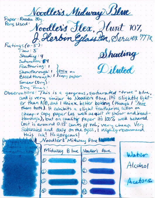
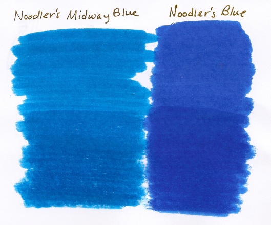
Here’s one of my favorite almost-pure blue inks. I say almost pure because I consider Noodler’s Blue the “bluest” blue of all the inks I’ve tried. They’re very similar, but I do prefer Midway Blue’s depth over the standard Blue’s.

This ink is part of the V-Mail Series modeled after several unused bottles of ink from the WWI-WWII era. I’ve found performance issues (feathering, bleedout, and bleedthorugh, to be precise) with every V-Mail color I’ve tried except for this one and North African Violet, another one of my favorites.

Noodler's Midway Blue (Medium)

Noodler's Blue vs Midway Blue (Medium)

← Older posts

Archives

  • September 2015
  • April 2014
  • March 2014
  • February 2014
  • January 2014
  • December 2013
  • November 2013
  • October 2013
  • August 2013
  • July 2013
  • June 2013
  • May 2013
  • April 2013
  • March 2013
  • February 2013
  • January 2013
  • December 2012
  • November 2012
  • June 2012
  • May 2012

Blogroll

  • Discuss
  • Five Cat Penagerie Youtube Channel
  • Get Inspired
  • Get Polling
  • Get Support
  • Learn WordPress.com
  • Theme Showcase
  • WordPress Planet
  • WordPress.com News

Categories

  • A Random Writing
  • Akkerman
  • Diamine
  • Ink Comparison
  • Ink Review
  • Iroshizuku
  • J. Herbin
  • Montblanc
  • Noodler's
  • Parker
  • Pen Repair
  • Pen Review
  • Private Reserve
  • Rohrer & Klingner
  • Sailor
  • Uncategorized
  • Various Pen Stuff
  • Video
  • Visconti
  • Waterman
  • Writing Sample

Enter your email address to follow this blog and receive notifications of new posts by email.

Create a free website or blog at WordPress.com.

bureaumishka

inlovewithjournals

musings on the hand-written life

TheRealDocSpaz

Life According to Doc Spaz

a Room with a View

Vintage Soviet USSR Fountain Pens and Pencils

Enjoy the Soviet Era Fountain Pens Design and Quallity

Newton Pens

Custom Fountain Pens

Fountain of Pens

Everything Related to Fountain Pens

Penfountain's Blog

Fountain pen, inks, nibs, paper and general stuff

Fountain Pen Restoration

Goodwriterspens's Blog

Fountain Pen Obsession

April's Atelier

Creative Projects and Happy Things

A Nice Young Lady Reads Smut

Exposing the most undervalued literature for the rippling package of pleasure it is.

Personal Geographic

Travels in a borderless world

An Inkophile's Blog

Fountain pens, ink, paper, watercolor and more

The Dizzy Pen

Fountain Pens, Inks, and More!

JustDaveyB

Mostly just about fountain pens, their nibs and inks.

From the Pen Cup

Who am I kidding...pen cups. As in plural.

lady dandelion

using pens, paper and photography

inginkpen

Thoughts on fountain pens and ink

Privacy & Cookies: This site uses cookies. By continuing to use this website, you agree to their use.
To find out more, including how to control cookies, see here: Cookie Policy
  • Follow Following
    • The Five Cat PENagerie
    • Join 62 other followers
    • Already have a WordPress.com account? Log in now.
    • The Five Cat PENagerie
    • Customize
    • Follow Following
    • Sign up
    • Log in
    • Report this content
    • View site in Reader
    • Manage subscriptions
    • Collapse this bar
 

Loading Comments...